Napa: habit tracking built on spaced repetition
A mobile app built around spaced repetition. Designed end-to-end in a 2-week sprint: from a chaotic set of developer wireframes to a complete, gamified learning experience.
- My role
- Product Designer
- Duration
- 2-week sprint
- Platform
- iOS and Android
Overview
Napa is a mobile app built around spaced repetition — a learning method that schedules memory reviews at optimal intervals, so you remember more with less effort.
The client was an independent developer with a solid concept: an app for building any memory habit — vocabulary, formulas, facts — using fully customizable repetition intervals. He came to me with 40 wireframes and a simple ask: make this look good. What followed was a complete rethinking of how the app was structured, navigated, and communicated — delivered in two weeks, cross-platform, within budget.
The problem
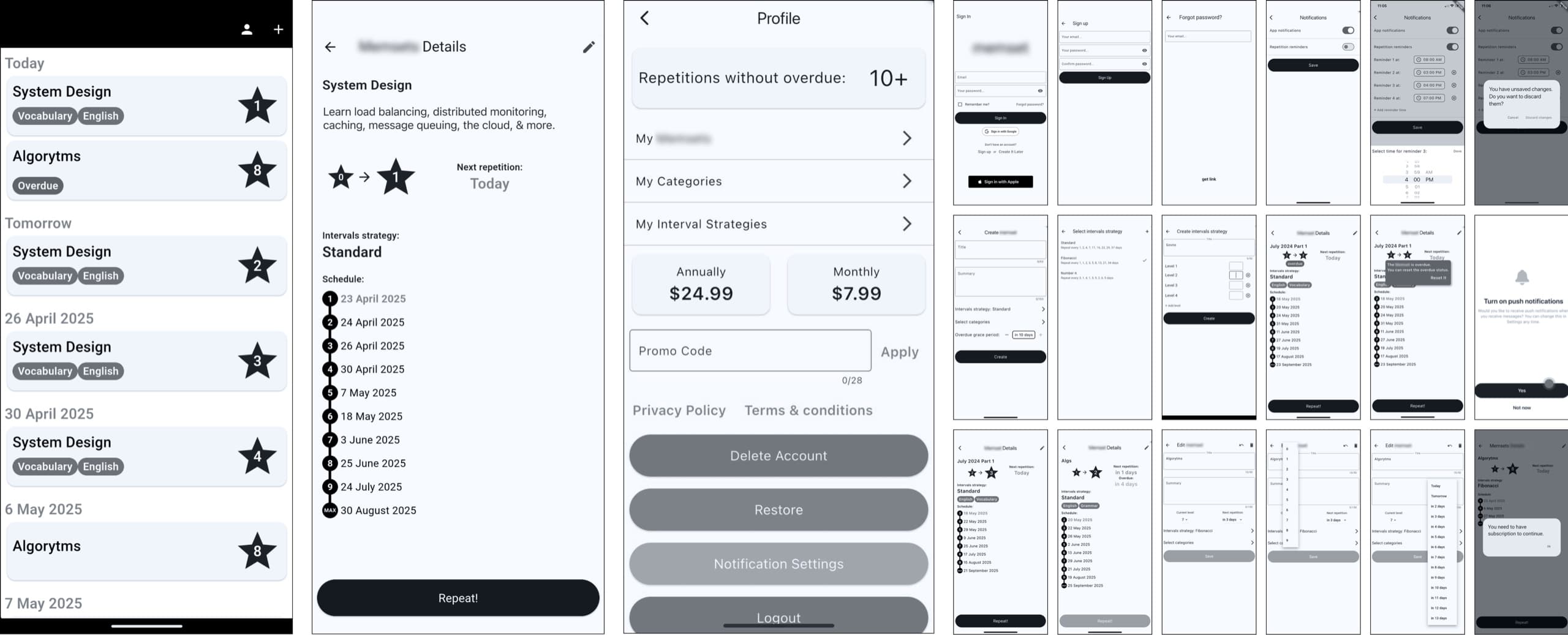
The architecture was built around how a developer thinks, not how a user navigates a daily habit. Three core problems stood out:
- Navigation was hidden inside Profile. Categories, all loops, subscription, promo codes — everything lived there. The Profile tab was doing the job of four different sections, and none of them well.
- The main screen had no motivational layer. A flat list of cards sorted by date, with no sense of progress or momentum.
- The wireframes had significant gaps. There was no Library — no place for users to manage all their loops and categories outside of today’s schedule. There was no onboarding. The subscription flow was a rough reference, not a real design.
Outcome
The client received a production-ready design that covered every screen, state, and edge case:
- 23 sections covering full app scope: auth, onboarding, main screen, library, create flow, loop details, profile (2 states), subscription flow, notifications
- The daily habit loop has a motivational layer
- Onboarding explains the product’s value in 4 screens
- Library gives users control over their content
- The visual system is consistent, distinctive, and scalable
- Complete UI kit for cross-platform (iOS + Android)
- Logo and app icon
- All edge cases designed and documented
Process
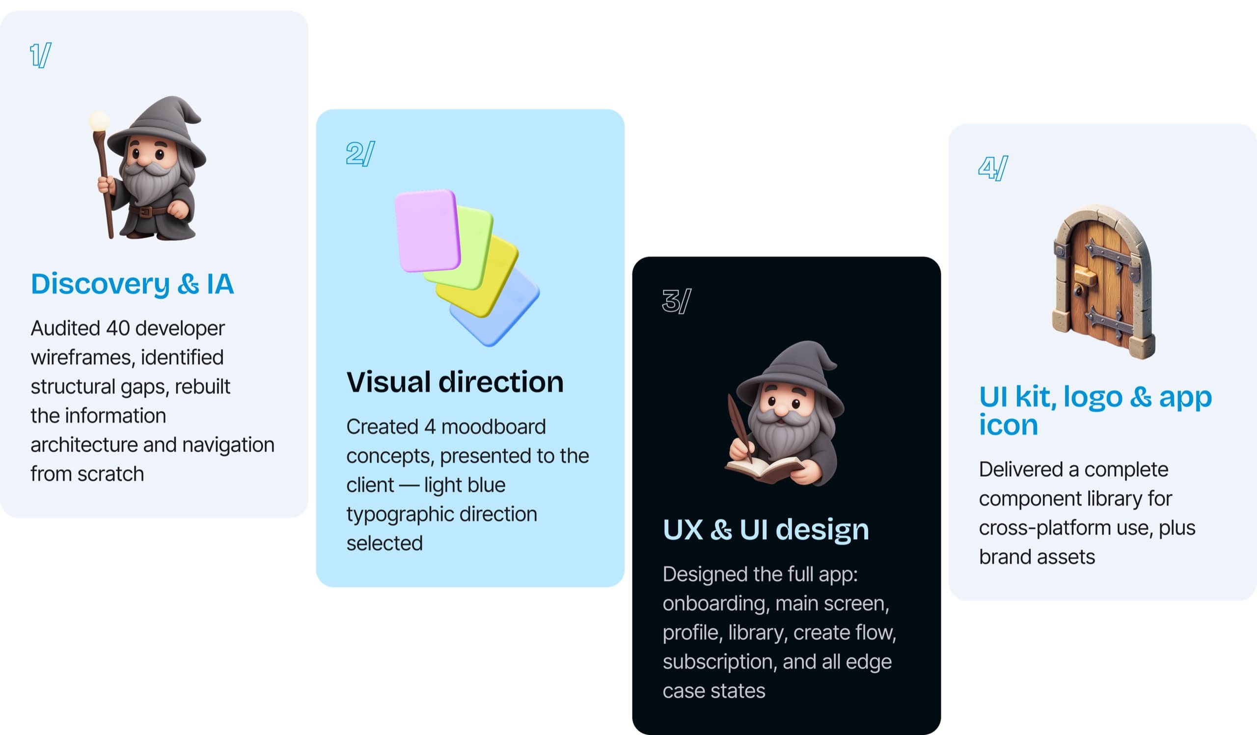
Discovery & IA
Analyzed 40 developer wireframes, identified broken navigation and structural gaps, rebuilt the information architecture from scratch.
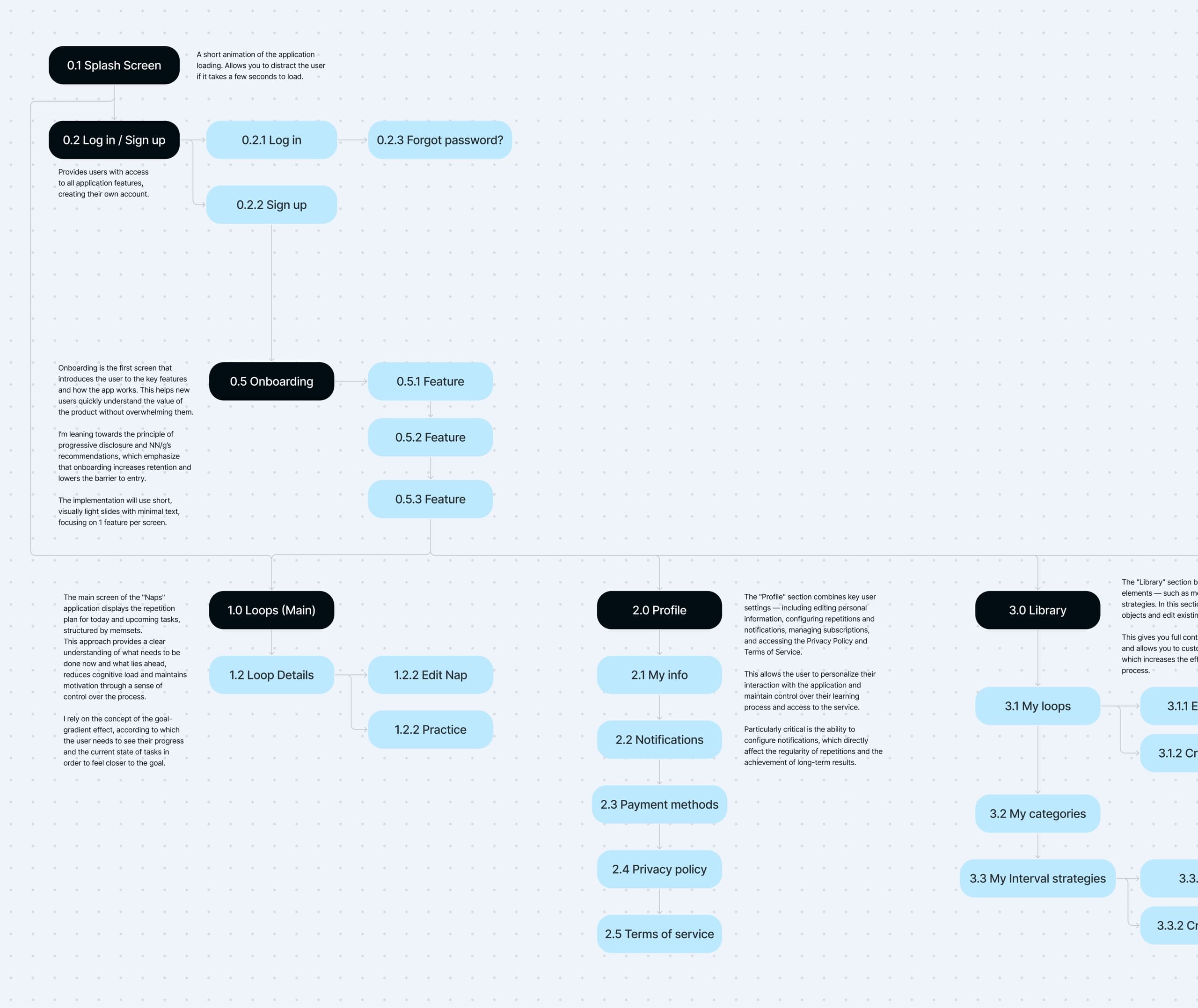
Site map
This single restructuring decision touched every other part of the design. It’s also what made the bottom navigation make sense.
I rebuilt the site map around how users think, not how the developer coded. The biggest change: everything that didn’t belong in Profile got its own place — Library, Subscription, and a dedicated Create flow.
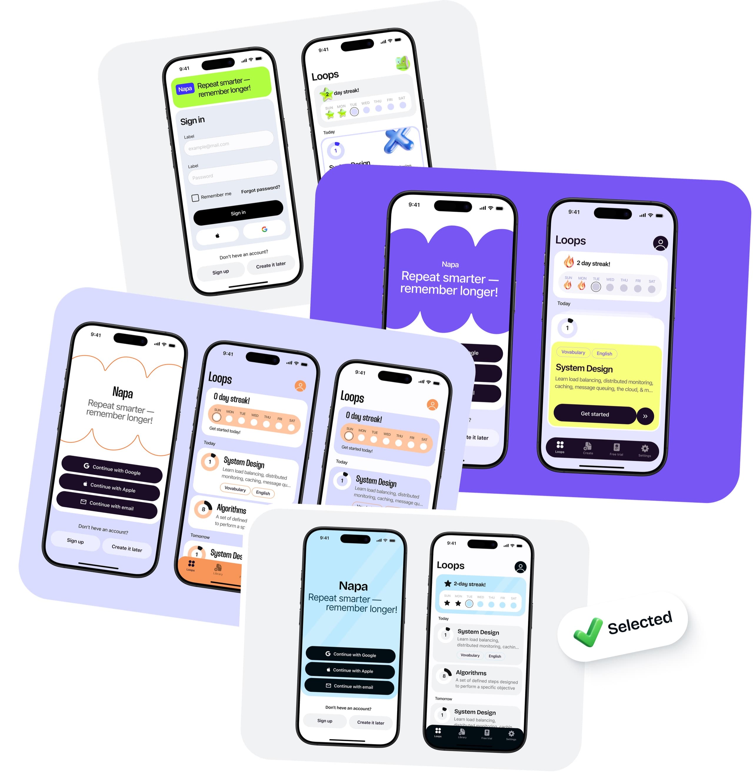
Moodboard & visual direction
I proposed four visual concepts to give the client a real choice, not just my preference.
Concept 4 — light blue, clean, typographic — was selected.
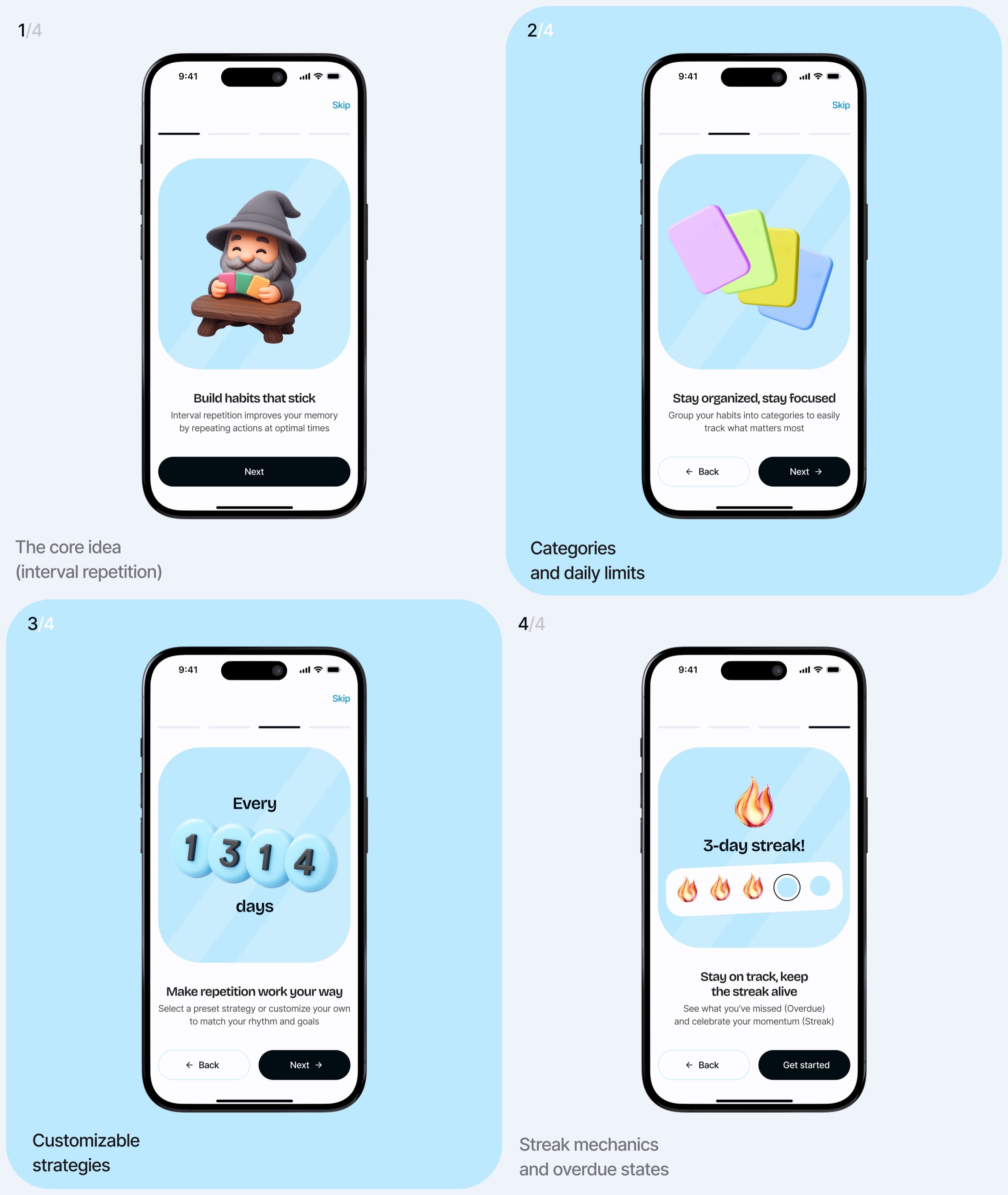
Onboarding
Each screen introduces exactly one concept. Four screens that introduce spaced repetition through the product’s own language, without jargon.
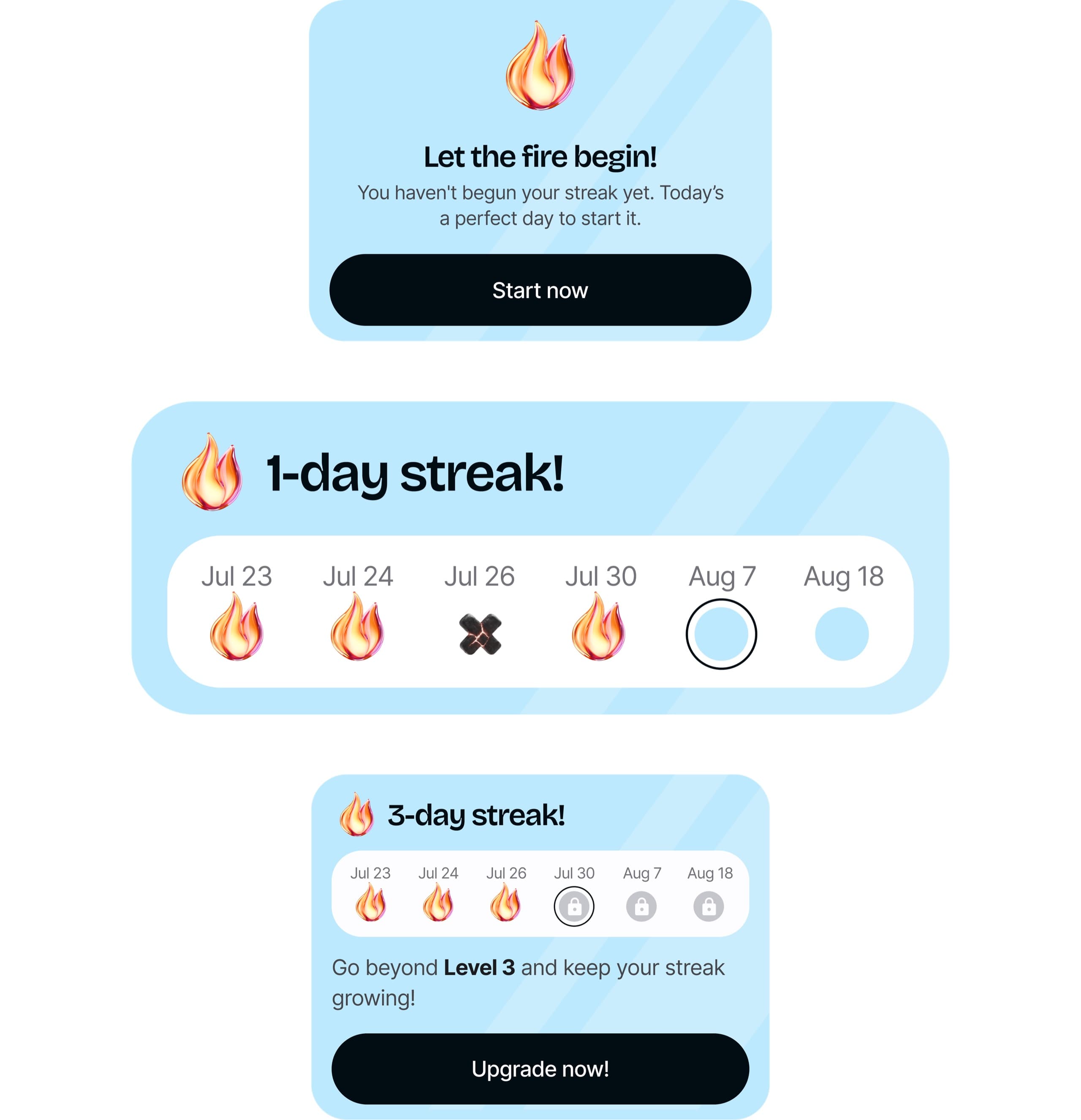
Streak widget
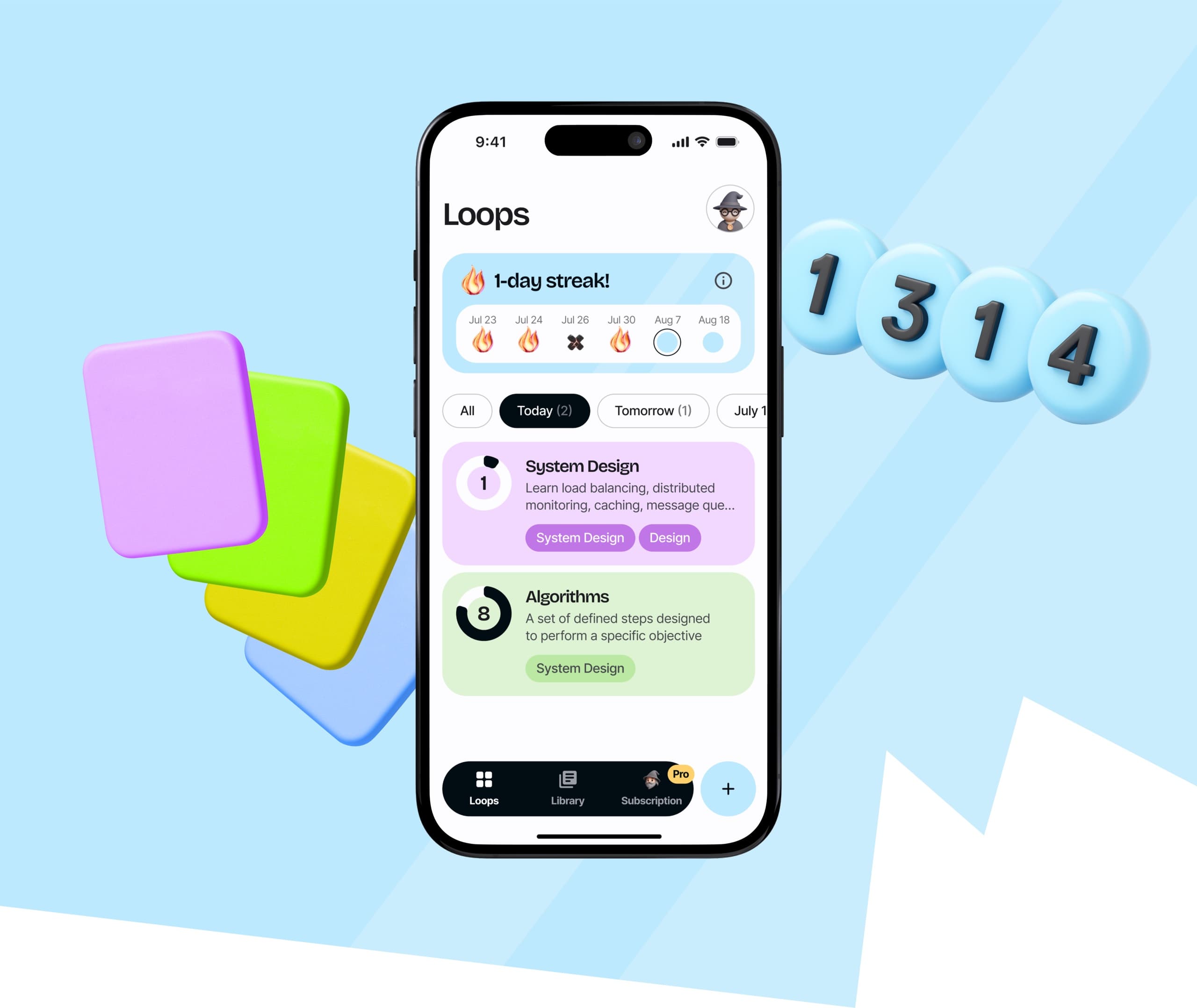
A running day count, a small calendar showing hit/miss/empty states, a daily recap card.
Main screen
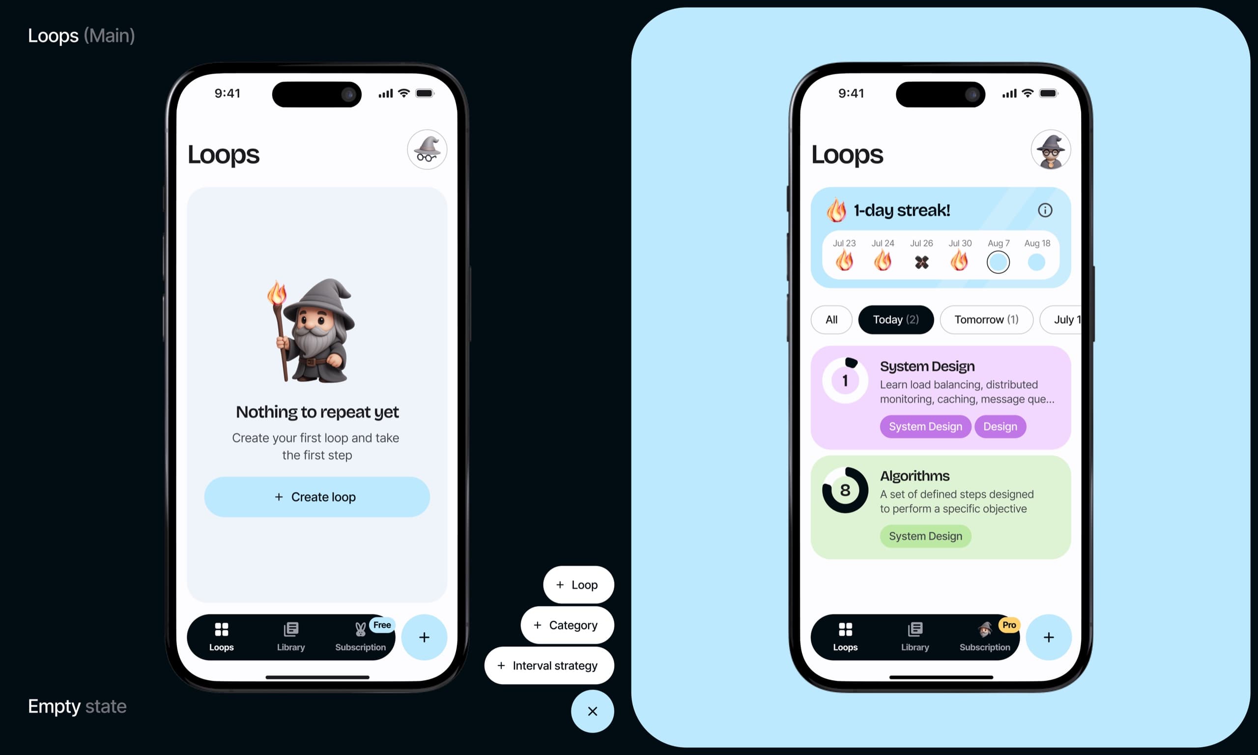
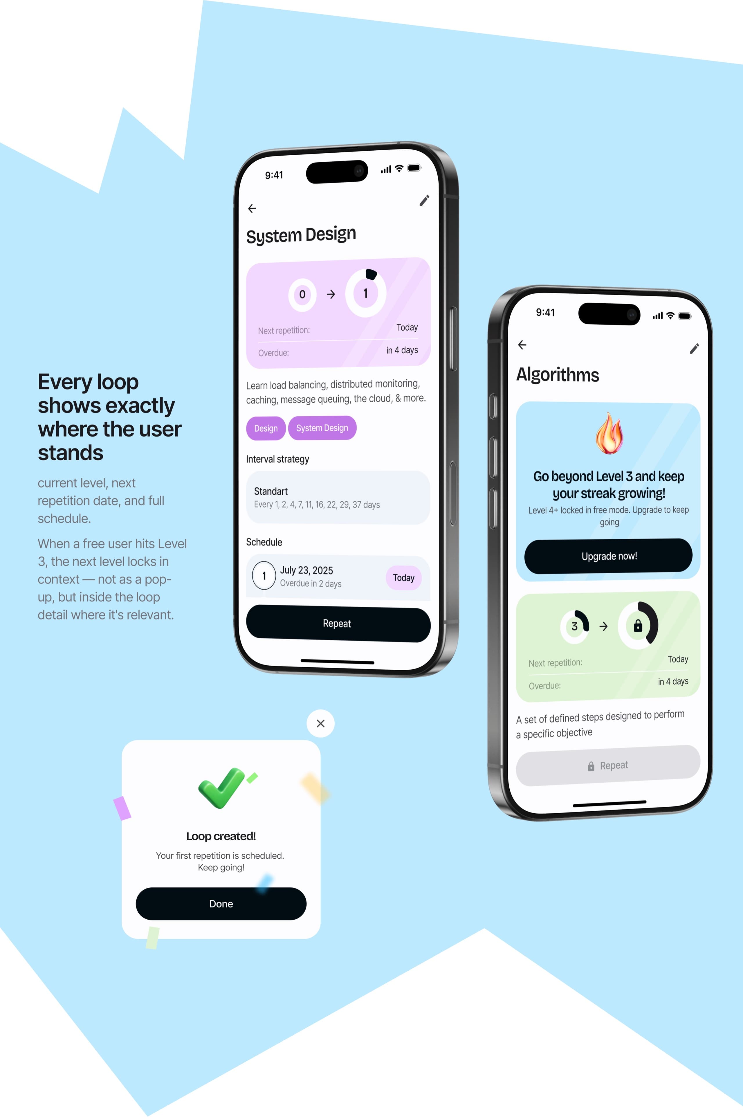
The developer’s version: a date-sorted list of cards. Functional, but flat.
My version: a daily habit tracker with a streak, filters, and a reason to come back tomorrow.
Library
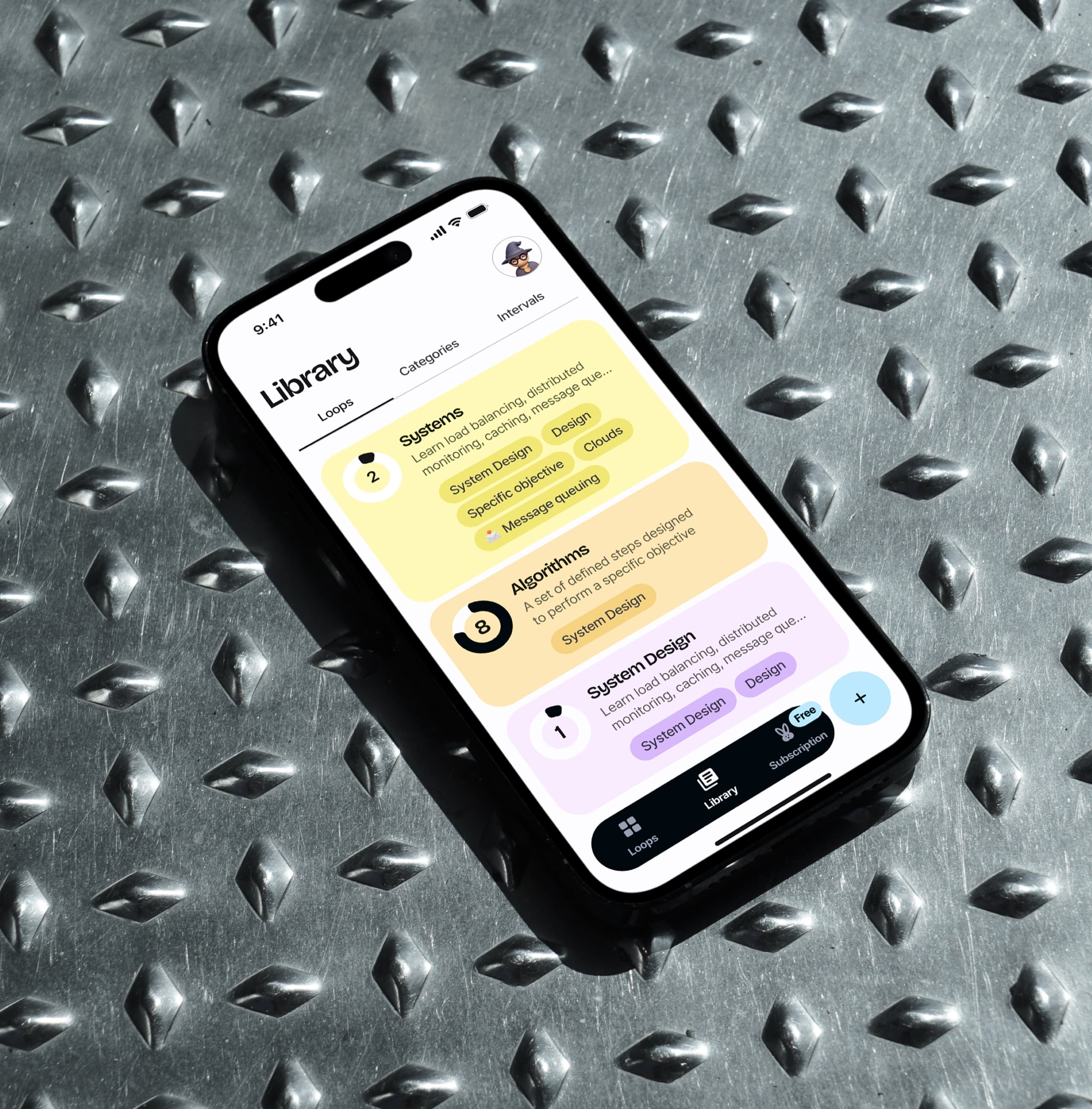
Users need a place to see and manage everything they’ve ever created — all loops, all categories, all interval strategies — regardless of schedule.
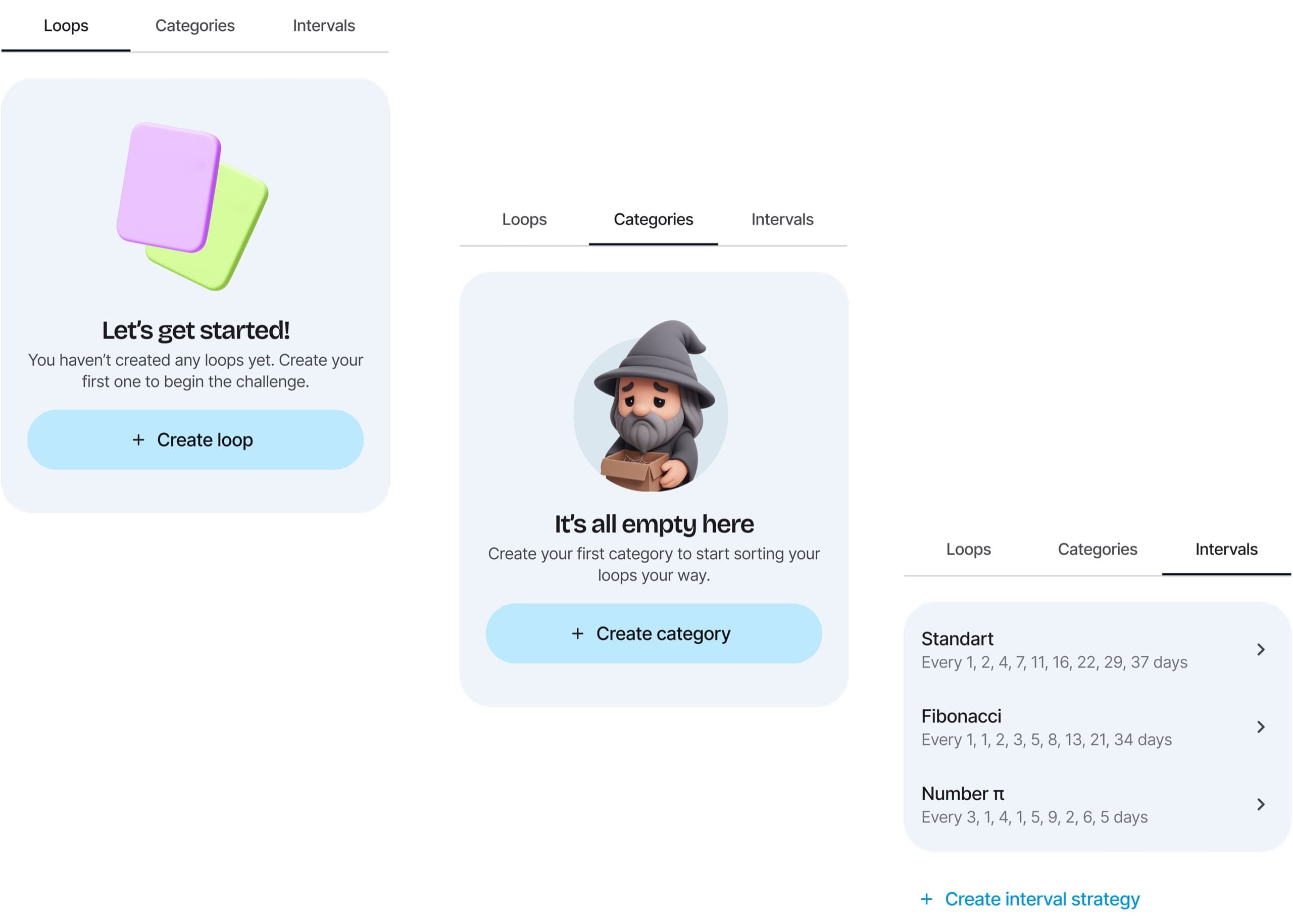
First open
Loops and Categories prompt the user to create their first item. Intervals come pre-loaded with three ready-to-use strategies.
Profile
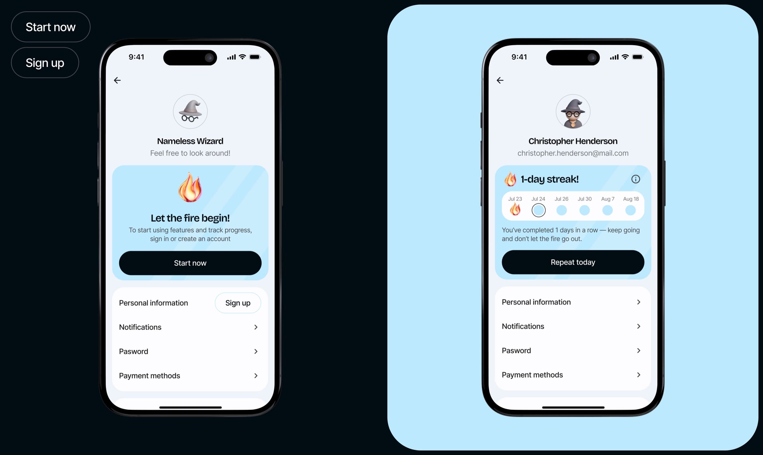
The developer’s Profile tab was a navigation junk drawer: categories, loops lists, subscription, promo codes, delete and restore actions all lived there.
I stripped it down to what Profile should actually contain: personal info, notifications, password management, payment methods, and account actions.
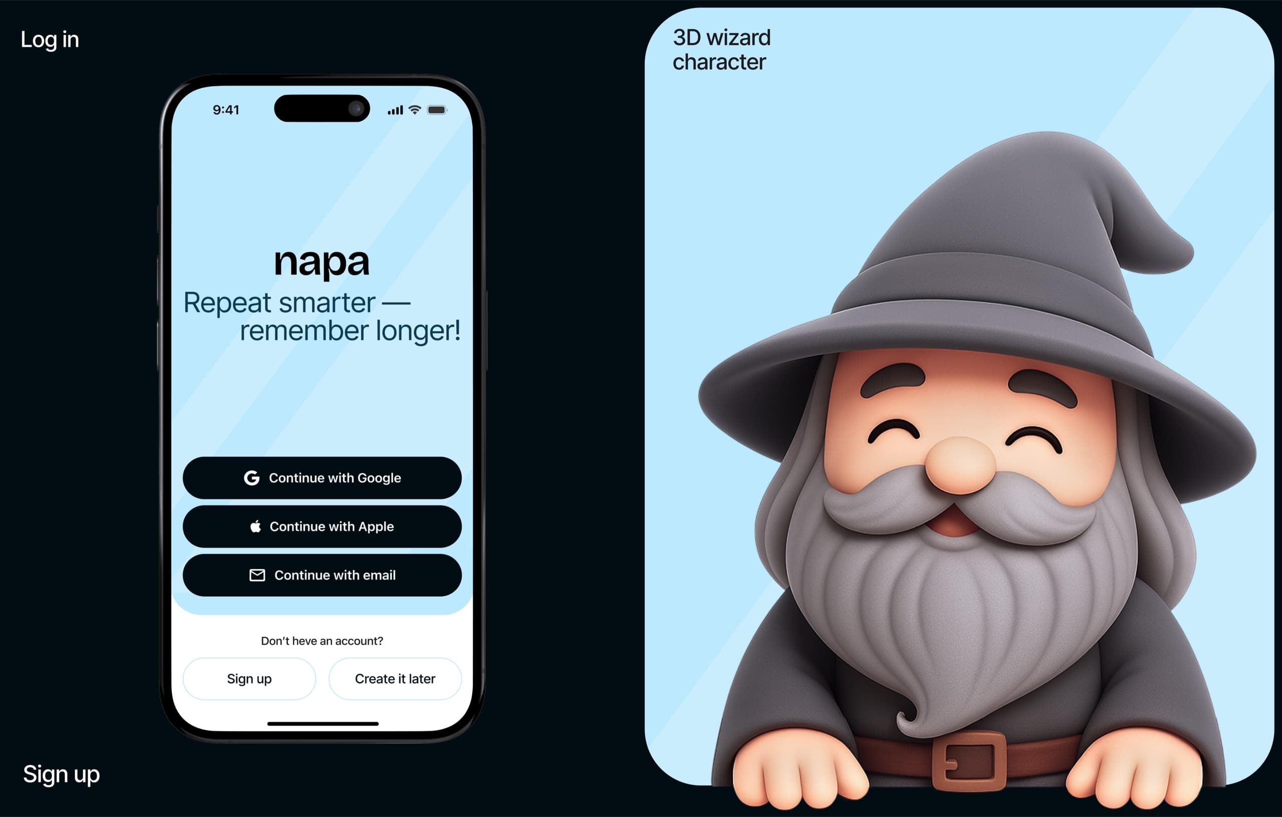
Wizard character system
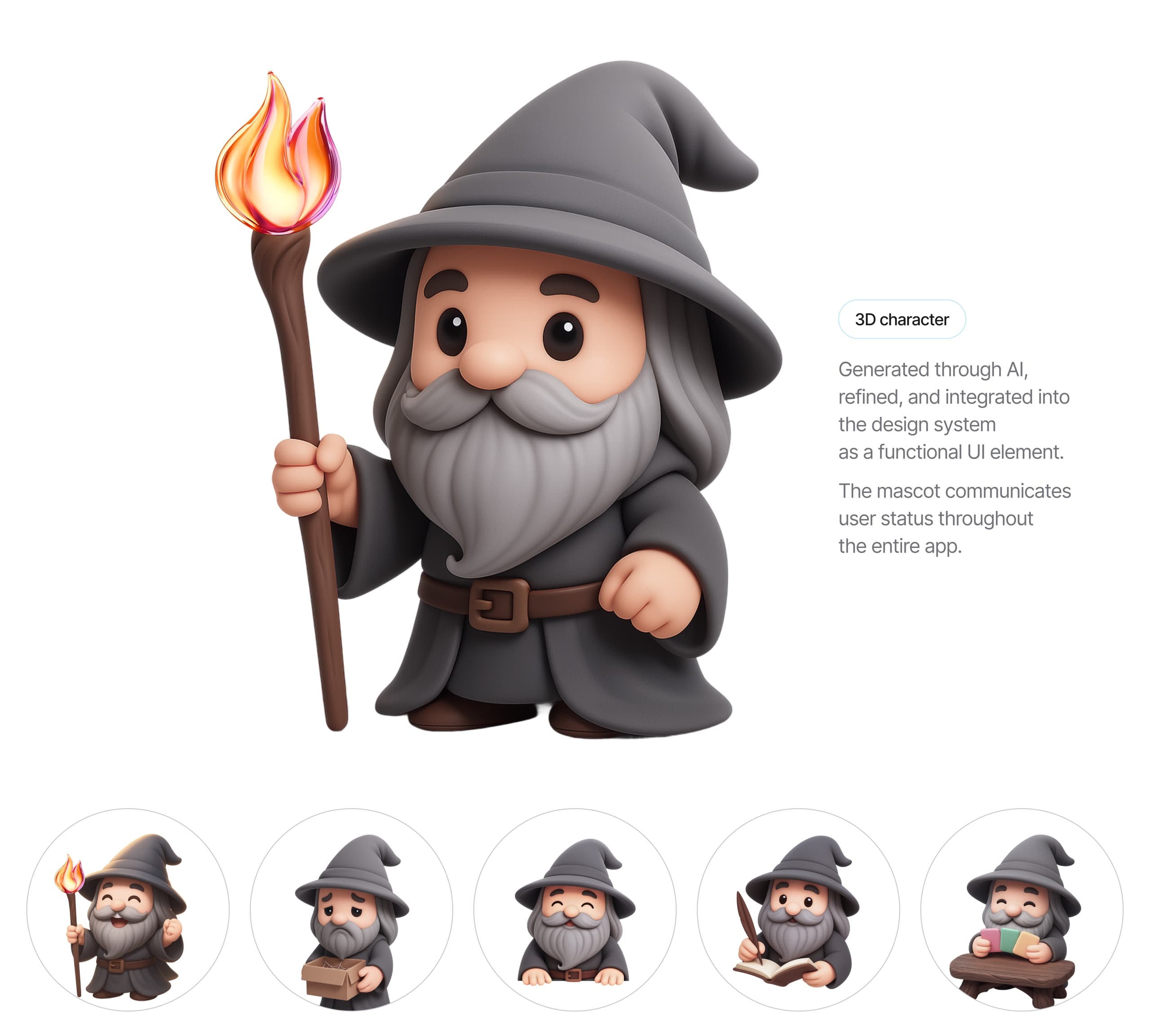
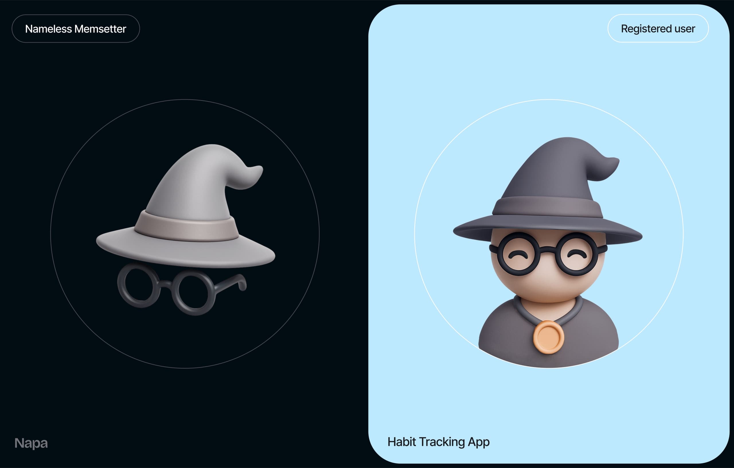
The client had one request: a wizard mascot. A wise old teacher who guides and helps.
I took that concept and turned it into a functional UI system.
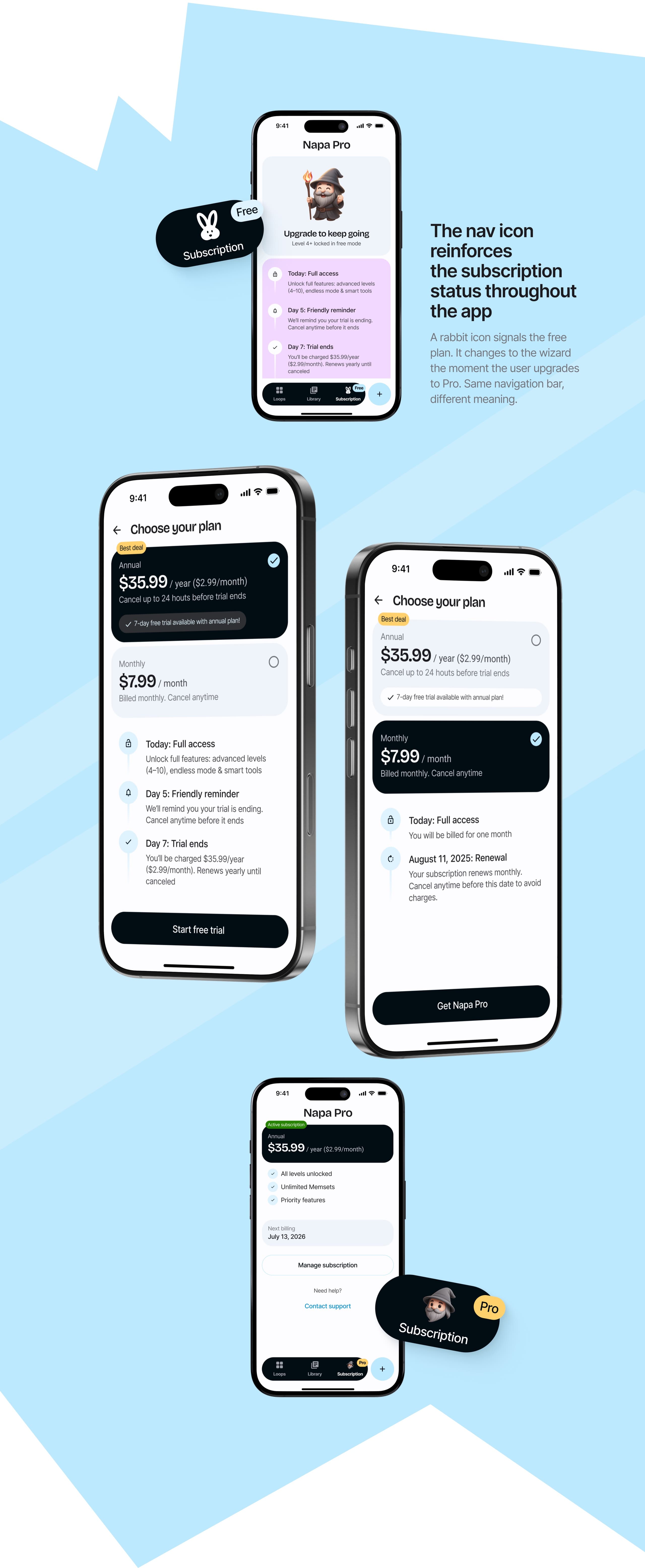
Subscription flow
Designed the full flow from scratch: benefits screen, plan selection, promo code, payment, active subscription state.